

Overview Deck for
Private Equity Firm


The image was magnified to enhance visibility, with each section delineated by a clear hierarchy. Numbers were emphasized, and placeholders were provided for company logos. A carefully chosen color palette was applied to create visually appealing sections.


The slide underwent a comprehensive transformation through data visualization, incorporating a map for enhanced clarity. We emphasized key numbers and conveyed comparisons through visually engaging infographics.


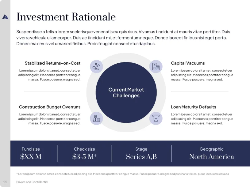
A circular infographic was crafted, with pertinent icons assigned to each category. Key numbers were highlighted, and a clear hierarchy, along with strategic color usage, facilitated the grasping of the key message easier.


